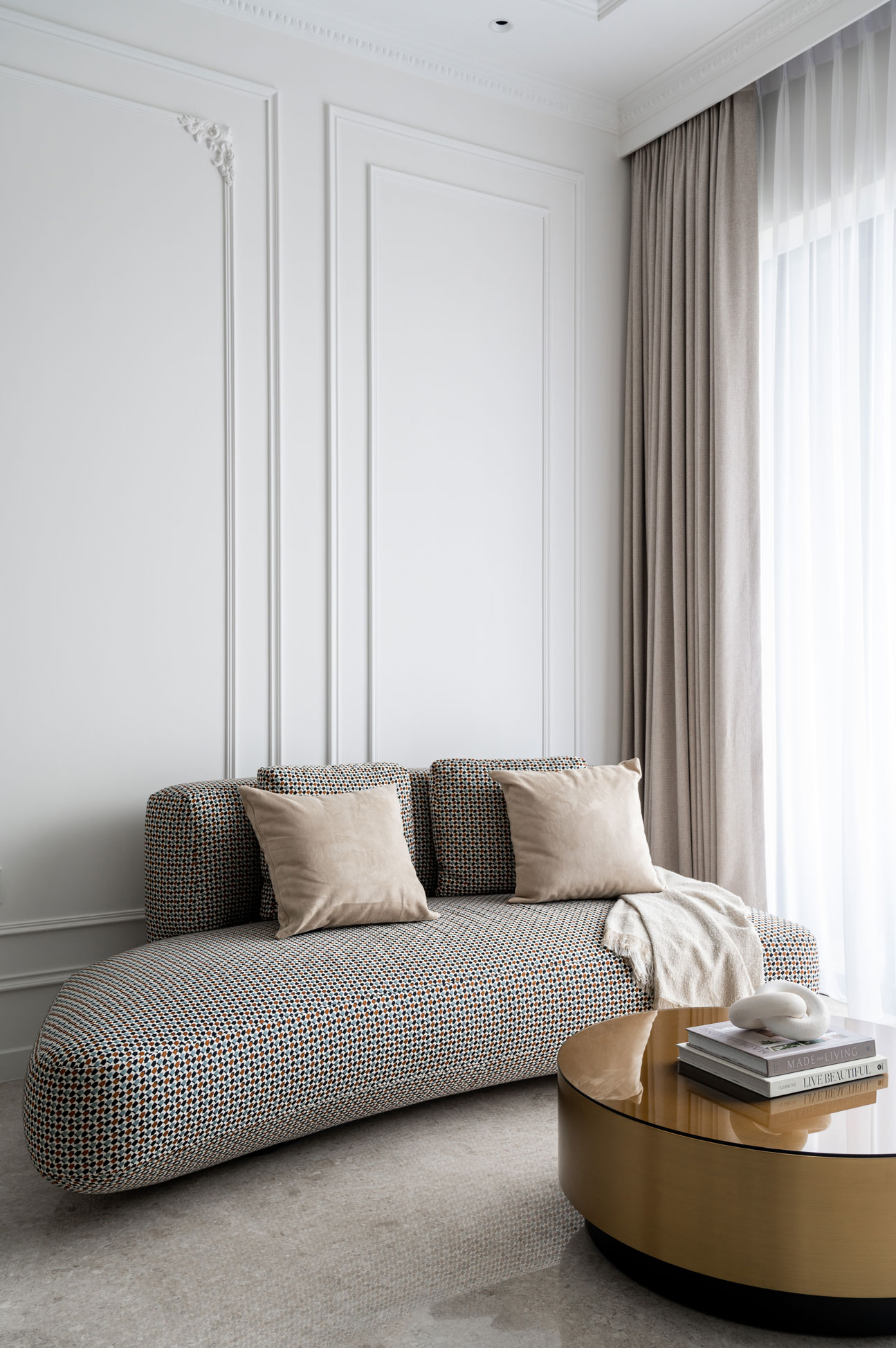
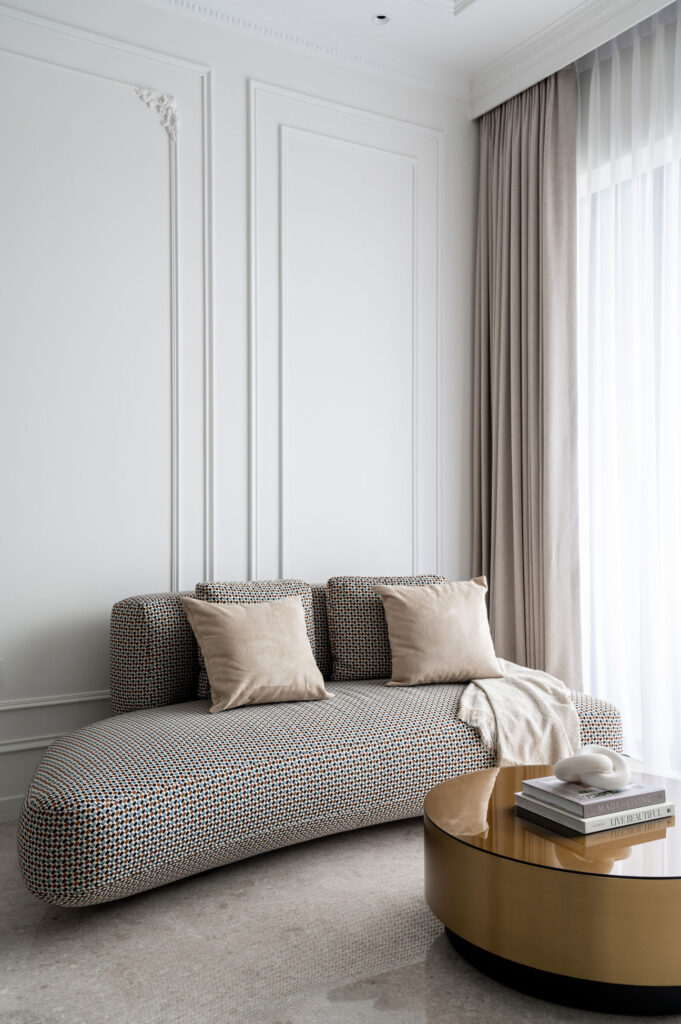
 While Scandinavian and Japanese minimalism are popular interior design choices, this homeowner decided to bring their love for classic architectural designs and French interior styles into their new home. “We initially pitched a Baroque style for the home, as the owner wanted a classical theme,” explained the designer. “However, it seemed too dramatic and bold with all the contrasting colours cramping a small residential space.”
 The key to a classic interior style, according the designer, is symmetry and order. When designing for a classical style, look for structure and balance. Accessorise with pieces that are rich in texture and finishes for a touch of luxury. “We implemented modern luxury elements to the Rococo style to make it a comfortable and inviting home,” said the designer.
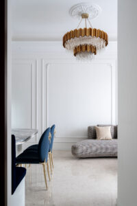 This was achieved with furniture placement and styling revolving around a specific focal point such as the chandelier, cushion, and marble console. During the initial design phase of this home, the designers decided that the best colour palette for the home would be light and creamy. This would especially work on the larger pieces of the home, such as walls, and decorative panels. Chrome or gold detailings helped break the monotony while adding a modern luxe vibe.
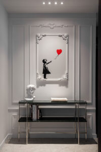 Upon stepping into the home, you’re greeted by the portrait of a little girl with a red balloon. The owner, who loves travelling, injected his personality into the interior with unique pieces that he liked such as this painting. Despite the overall monochromatic colour scheme of the living space, this contrasting piece of art is one of the many ways this home showcased little punches of fun in an otherwise classical interior.
To really bring out the Rococo style, the designers played around with the cornices, adding organic patterns of leaves and flowers. “This helped us introduce the Rococo style into a modern and minimal interior design,” explained the designer. The addition of curved legs and fluid shapes within the furniture and mirror in the dining area added a playful yet gentle touch to the overall interior. It was fine details such as these that made the Rococo pieces contrast elegantly in a minimal setting. In the end, it was the perfect proportional representation of scales, colours, textures, and patterns that resulted in a cohesive and plush living area.
Within the living room was also the dining area, which was a talking piece of its own. An L-shaped bench in rich velvety blue complemented the Sensa stone table, while the dining chairs were the owner’s personal additions to the space. “I personally loved that the dining area had a built-in L-shaped bench,” said the designer. “It’s perfect for hosting large groups of guests while keeping the dining space organised.”
The owner also fell in love with the dining table top made from Sensa stone. Its grey veins and smooth surface finish brought out the eloquence of the table, making it a key focal point of the dining area.
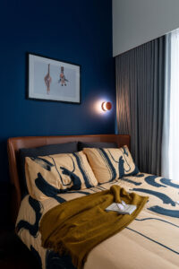 While the main area of the home had a cohesive neutral palette with metallic accents, the bedrooms had completely different characters. “Everything doesn’t need to match,” stated the designer. The living room has a classically white look, which is comfortable to the eyes. However, all-white might start being too clinical in a daily setting. “That’s why the owner and us decided to create a different vibe for each bedroom by playing around with colours.”
“Liking one colour doesn’t mean you’d like being surrounded by it all the time,” continued the designer. That’s where colour theory comes into play. Magic happens when you combine colours you love into a theme for your rooms, allowing you to feel energised or calmed. One of the bedrooms adopted a navy-coloured accent wall, paired with a tan leather bed frame. The combination of colours in this room gave off a masculine vibe, offset with a tinge of playfulness thanks to the giraffe painting.
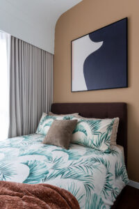
For a calmer setting, another bedroom had a sandy-coloured accent wall with dark furnishings. This evoked a neutral style that was anything but boring, utilising the contrast between dark leather and textile with a light-coloured wall. The third room was perhaps most reminiscent of the living area’s style, with white walls distinguished with a half accent wall and metallic gold trims. Dark furnishings enhanced this elegant look, while the minimal lighting display was contemporary and unique.
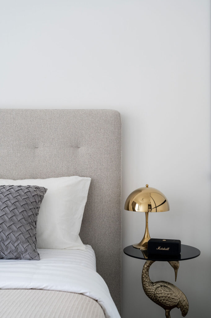 The home was a perfect showcase of how classical themed homes can still fit within the modern realms of minimalism, yet have space to fit the individuality of its inhabitants. A house is, after all, made a home by being able to fit to the owner’s lifestyle.

